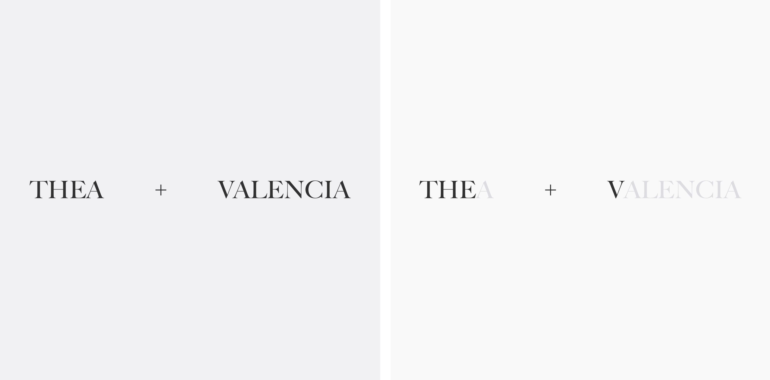
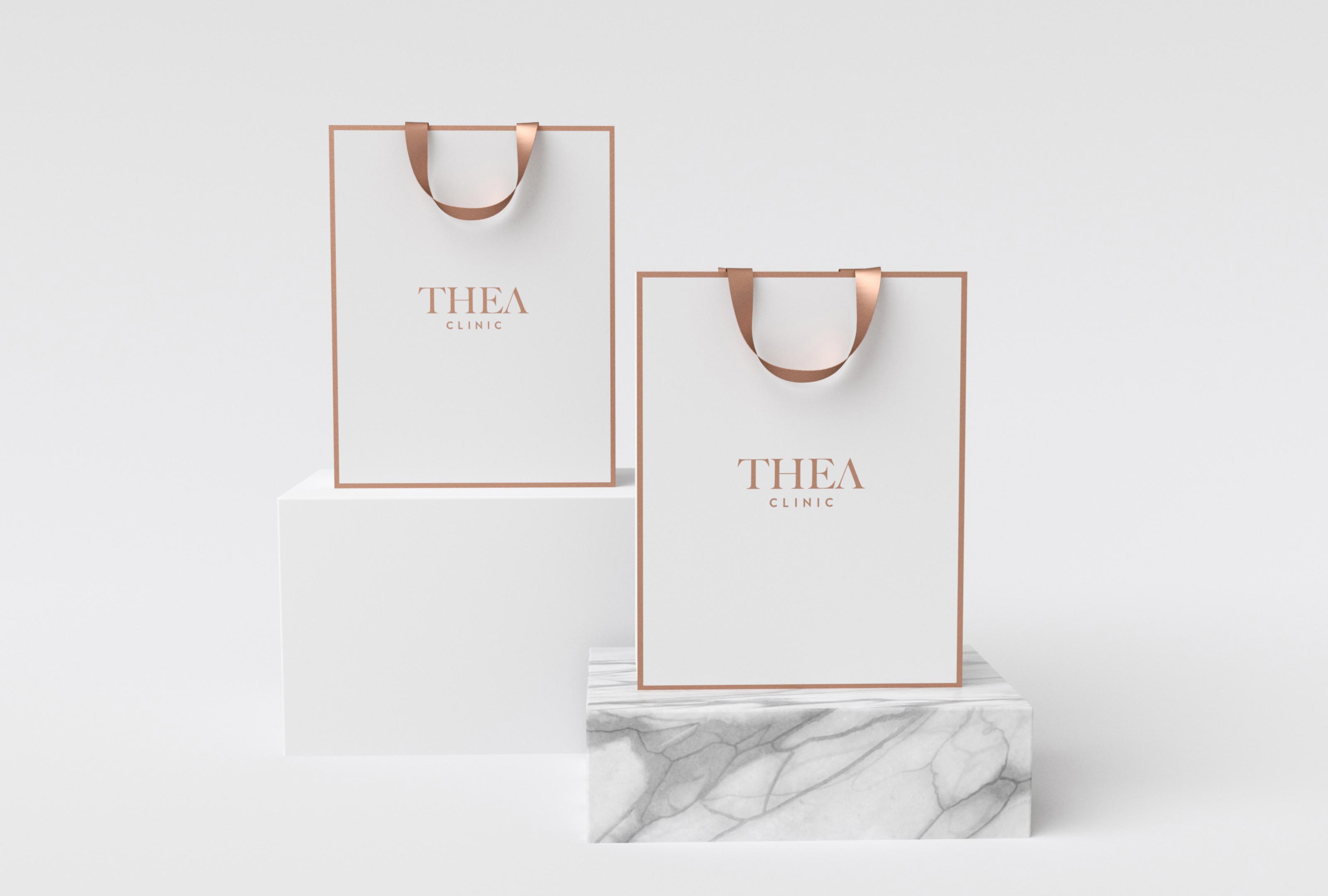
Inspired by the old greek feel we redesigned Thea’s logotype using a classic serif-font with a little twist in the end. The name Thea is a representation of the beauty clinics, however, Valencia, the owner is the front face of this beauty chain represents Thea. For this reason it was obvious to us finding a way merging the 2 identities.

Thea
Client
Thea
Service
Rebranding, In-store App, Marketing & UI/UX Direction
Industry
Beauty & Health
Established in 2015, Thea is a chain of international standard clinics in Vietnam currently with 3 locations throughout Ho Chi Minh City in respectively District 7, District 1 and Binh Thanh District. Thea’s founder and CEO Valencia Tran stands by the immense value to be sold to prospective clients and users of Thea, whether in using the services or products offered.
Rejuvenating
inside-out

Strategy, Plan & Execution
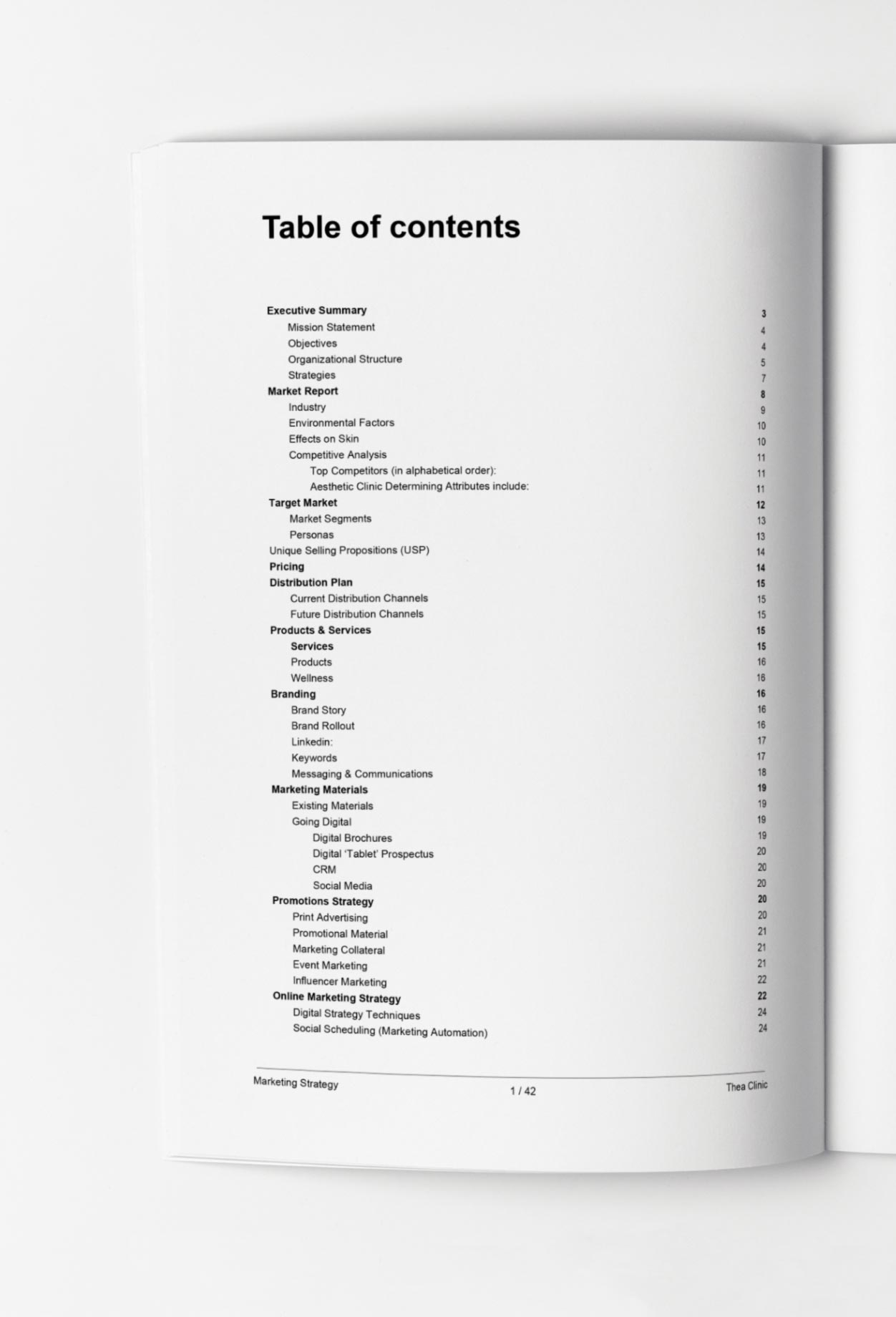
Main Objectives
Reposition within the competitive market by application of new brand image,
new website renovated branches, and new ‘digital strategy’.
Solidify the new branding through use of social media and attract new and
existing customers to increase branch foot traffic.
Shift the existing marketing strategy from traditional and costly to digital and
economic.

“Thank you very much to you and your team! It is very professional and I can’t wait to see everything happened together to bring the new look and new era to Thea! Cheers”
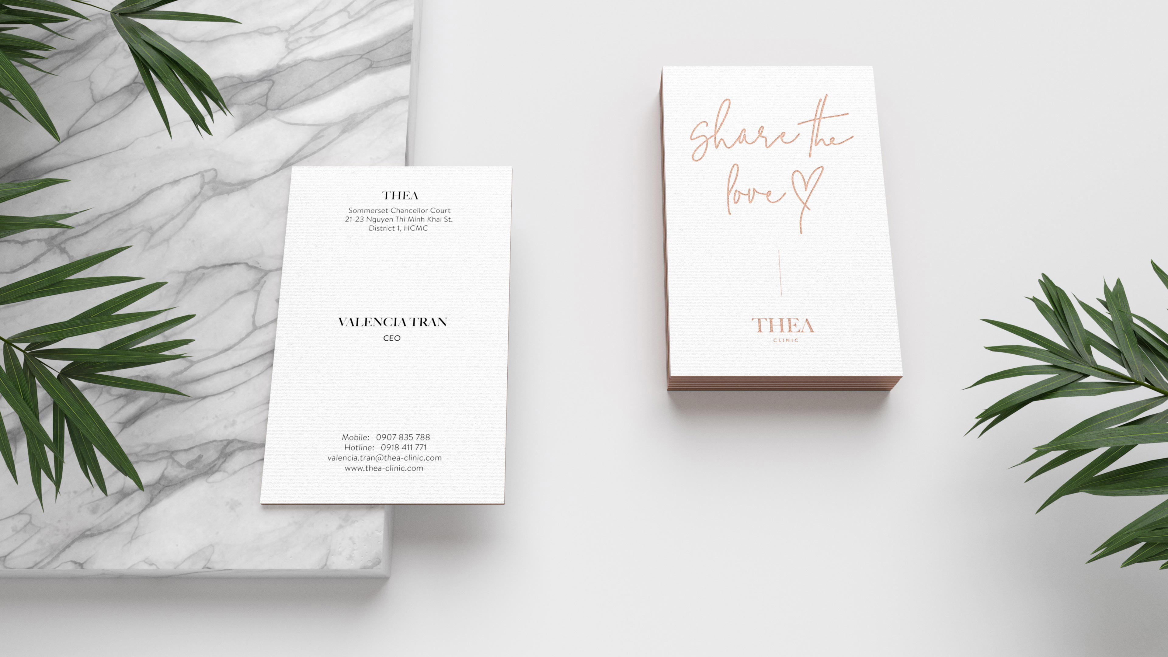
Valencia Tran
CEO @ Thea